With Windows 8.1 Microsoft updated the Segoe UI Symbol font and added a nice amount of icons for the most commonly actions used in application bar buttons. The reason behind this was to replace the old method of creating small PNG images to use as the content of the buttons and directly use font glyphs that would scale nicely across all target resolutions.
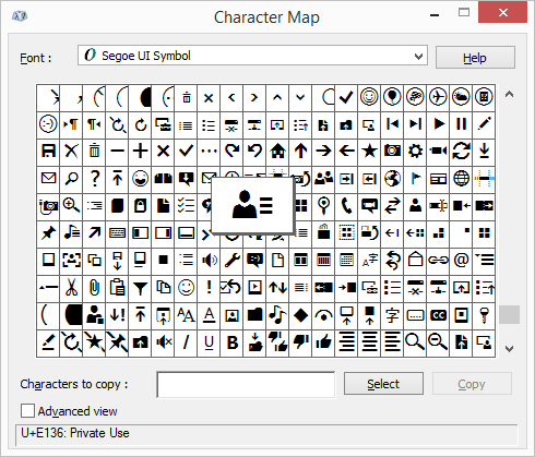
This font also introduces some other symbols like back/forward arrows, hearts for favourited items and even the tick parts of CheckBox and RadioButton controls. However, the standard XAML controls still don’t use it so I’m assuming they were thought for using inside HTML/WinJS apps.
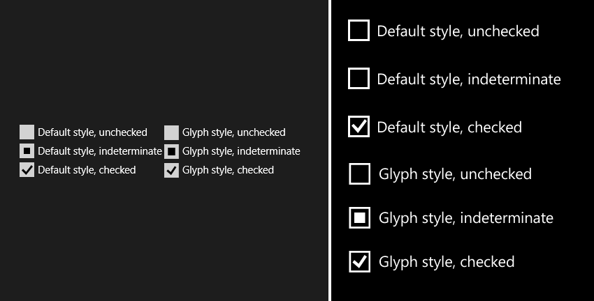
Today, we are going to dissect the CheckBox control to see what parts it is composed of, and will be switching standard XAML shapes and paths for glyphs when applicable.
Understanding the parts of the CheckBox control
Let’s start by creating a new Universal App project and adding a CheckBox control to both the MainPage of the Windows 8.1 and Windows Phone projects. We have to do it this way since the styles for both platforms are a little different, and we want to make them as accurate to the original version as possible.
Now, to better work with control styles, open the project in Blend. Right click the CheckBox control and select Edit Template > Edit a Copy… . Set a name in the new dialog (we will be using CheckBoxGlyphStyle) and make sure it’s defined at the document level so there aren’t any duplicate names in App.xaml. Now, if you have never customized control templates or styles, what it does is copy all the default XAML for the control so you can edit it and override whatever you want, including animations and visual states.
If you examine the generated templates for both controls, you will see that they have some things in common:
- Both have a grid that encompasses the ContentPresenter (where the text or custom content will be displayed) and another grid for holding the tick/check part.
- Inside that grid, both have a Path named CheckGlyph to the represent the tick mark.
However, other parts are platform specific.
Windows Phone
- The indeterminate mark is a Rectangle called NormalRectangle.
- A Border named CheckBackground is used as the background of the tick. Its BorderThickness is directly bound to the same property of the CheckBox control.
- The root container of the control is a Grid.
- Display of parts depending on the visual state is controlled through the Visibility property.
Windows 8.1
- The indeterminate mark is a Rectangle too, but this time it’s called IndeterminateGlyph.
- The NormalRectangle exists, too, but in this case is a Rectangle that acts as the background of the tick part.
- The root container of the control is a Border, whose BorderThickness is bound to the same property of the CheckBox control.
- Display of parts depending on the visual state is controlled through the Opacity property.
- There are two other rectangles, FocusVisualWhite and FocusVisualBlack, for displaying that the control has focus while tab navigating.
Take a deep look at the default templates generated for both controls and make you comfortable with them. When you are ready, let’s start customizing them.
Switching from shapes to glyphs
To achieve our goal we must replace some of the existing XAML shapes with TextBlock controls containing a single glyph. Since the process has some differences depending on the target platform, we are going to detail them separately:
Windows Phone
- Give a name to the Grid that contains the tick parts, since we will set some of its properties via a visual state later. We will be using CheckGrid.
- Create three TextBlock controls inside this grid and name them as the existing control parts.
- Set their font family to Segoe UI Symbol and size to the system resource called TextStyleLargeFontSize.
- Match the HorizontalAlignment and VerticalAlignment with those of the old controls; in some instances the glyphs will appear cut off due to font padding/kerning. You can try fixing this for perfection or leave it as is.
- Set their Text values to the matchings glyphs (this is more easily achieved by writing the escaped value in XAML code). The escaped values for each one are as follows:
| Usage | Escaped Unicode | Glyph |
|---|---|---|
| Border |  | |
| Tick |  | |
| Indeterminate |  | |
- Match the IsHitTestVisible and Visibility properties with those of the old controls.
- Now, since the brush properties of the old and new controls are different, we have to try and match the bindings as closely as possible:
| Control and property | Binding value |
|---|---|
| CheckBackground Foreground | TemplateBinding BorderBrush |
| Parent Grid Background | TemplateBinding Background |
| NormalRectangle Foreground | ThemeResource CheckBoxForegroundThemeBrush |
| CheckGlyph Foreground | ThemeResource CheckBoxForegroundThemeBrush |
WARNING: by default, the indeterminate state of the CheckBox is broken! The theme background brush is incorrectly assigned to NormalRectangle instead of the foreground one, so if you declare the control as IsThreeState you can see it behave erroneously.
<Grid x:Name=”CheckGrid” Grid.Column=”0″ VerticalAlignment=”Top” Background=”{TemplateBinding Background}“>
<TextBlock x:Name=”CheckBackground” HorizontalAlignment=”Center” Text=”” VerticalAlignment=”Top” FontFamily=”Segoe UI Symbol” IsHitTestVisible=”False” Foreground=”{TemplateBinding BorderBrush}“ FontSize=”{StaticResource TextStyleLargeFontSize}“/>
<TextBlock x:Name=”NormalRectangle” HorizontalAlignment=”Center” Text=”” VerticalAlignment=”Top” FontFamily=”Segoe UI Symbol” IsHitTestVisible=”False” Visibility=”Collapsed” Foreground=”{ThemeResource CheckBoxForegroundThemeBrush}“ FontSize=”{StaticResource TextStyleLargeFontSize}” />
<TextBlock x:Name=”CheckGlyph” HorizontalAlignment=”Center” Text=”” VerticalAlignment=”Top” FontFamily=”Segoe UI Symbol” IsHitTestVisible=”False” Visibility=”Collapsed” Foreground=”{ThemeResource CheckBoxForegroundThemeBrush}“ FontSize=”{StaticResource TextStyleLargeFontSize}” />
</Grid>
Windows 8.1
- Create three TextBlock controls inside this grid and name them as the existing control parts that aren’t focus visuals.
- Set their font family to Segoe UI Symbol and size to 11 points.
- Again, match the HorizontalAlignment and VerticalAlignment with those of the old controls. Fix the small displacements adjusting margins if you want.
- Set their Text values to the matchings glyphs. They are almost the same, except that in this instance the tick has a solid background instead of a border:
| Usage | Escaped Unicode | Glyph |
|---|---|---|
| Background |  | |
| Tick |  | |
| Indeterminate |  | |
- Match the Opacity properties with those of the old controls.
- Again, match the brush properties using the following table:
| Control and property | Binding value |
|---|---|
| NormalRectangle Foreground | ThemeResource CheckBoxBackgroundThemeBrush |
| CheckGlyph Foreground | ThemeResource ComboBoxForegroundThemeBrush |
| IndeterminateGlyph Foreground | TemplateBinding ComboBoxForegroundThemeBrush |
<Grid VerticalAlignment=”Top”>
<TextBlock x:Name=”NormalRectangle” HorizontalAlignment=”Center” Text=”” VerticalAlignment=”Center” FontFamily=”Segoe UI Symbol” Foreground=”{ThemeResource CheckBoxBackgroundThemeBrush}“/>
<TextBlock x:Name=”CheckGlyph” HorizontalAlignment=”Center” Text=”” VerticalAlignment=”Center” FontFamily=”Segoe UI Symbol” Foreground=”{ThemeResource ComboBoxForegroundThemeBrush}“ Opacity=”0″/>
<TextBlock x:Name=”IndeterminateGlyph” HorizontalAlignment=”Center” Text=”” VerticalAlignment=”Center” FontFamily=”Segoe UI Symbol” Foreground=”{ThemeResource ComboBoxForegroundThemeBrush}“ Opacity=”0″/>
<Rectangle x:Name=”FocusVisualWhite” Height=”27″ Opacity=”0″ StrokeDashOffset=”0.5″ StrokeEndLineCap=”Square” Stroke=”{ThemeResource FocusVisualWhiteStrokeThemeBrush}“ StrokeDashArray=”1,1″ Width=”27″/>
<Rectangle x:Name=”FocusVisualBlack” Height=”27″ Opacity=”0″ StrokeDashOffset=”1.5″ StrokeEndLineCap=”Square” Stroke=”{ThemeResource FocusVisualBlackStrokeThemeBrush}“ StrokeDashArray=”1,1″ Width=”27″/>
</Grid>
Fixing the visual states
Now you could run the project in both platforms and check that it displays correctly. However, interacting with the CheckBox controls in any way will crash the application. This is due to changing the parts that compose the control, so when a new visual state tries to change a property that doesn’t exist an exception is thrown. We are going to fix this by modifying the default visual states so they match our new layout.
Windows Phone
In this case we only need to modify the Pressed and Disabled visual states, since they are the ones that change the conflicting values. We need to match the Storyboard.TargetProperty and Storyboard.TargetName accordingly to the names and properties of the new control parts.
<VisualState x:Name=”Pressed”>
<Storyboard>
<PointerDownThemeAnimation Storyboard.TargetName=”Grid”/>
<ObjectAnimationUsingKeyFrames Storyboard.TargetProperty=”Background” Storyboard.TargetName=”CheckGrid”>
<DiscreteObjectKeyFrame KeyTime=”0″ Value=”{ThemeResource CheckBoxPressedBackgroundThemeBrush}“/>
</ObjectAnimationUsingKeyFrames>
<ObjectAnimationUsingKeyFrames Storyboard.TargetProperty=”Foreground” Storyboard.TargetName=”CheckGlyph”>
<DiscreteObjectKeyFrame KeyTime=”0″ Value=”{ThemeResource CheckBoxPressedForegroundThemeBrush}“/>
</ObjectAnimationUsingKeyFrames>
<ObjectAnimationUsingKeyFrames Storyboard.TargetProperty=”Foreground” Storyboard.TargetName=”NormalRectangle”>
<DiscreteObjectKeyFrame KeyTime=”0″ Value=”{ThemeResource CheckBoxPressedBackgroundThemeBrush}“/>
</ObjectAnimationUsingKeyFrames>
</Storyboard>
</VisualState>
<VisualState x:Name=”Disabled”>
<Storyboard>
<ObjectAnimationUsingKeyFrames Storyboard.TargetProperty=”Foreground” Storyboard.TargetName=”CheckBackground”>
<DiscreteObjectKeyFrame KeyTime=”0″ Value=”{ThemeResource CheckBoxDisabledBorderThemeBrush}“/>
</ObjectAnimationUsingKeyFrames>
<ObjectAnimationUsingKeyFrames Storyboard.TargetProperty=”Foreground” Storyboard.TargetName=”CheckGlyph”>
<DiscreteObjectKeyFrame KeyTime=”0″ Value=”{ThemeResource CheckBoxDisabledForegroundThemeBrush}“/>
</ObjectAnimationUsingKeyFrames>
<ObjectAnimationUsingKeyFrames Storyboard.TargetProperty=”Foreground” Storyboard.TargetName=”NormalRectangle”>
<DiscreteObjectKeyFrame KeyTime=”0″ Value=”{ThemeResource CheckBoxDisabledBackgroundThemeBrush}“/>
</ObjectAnimationUsingKeyFrames>
<ObjectAnimationUsingKeyFrames Storyboard.TargetProperty=”Foreground” Storyboard.TargetName=”ContentPresenter”>
<DiscreteObjectKeyFrame KeyTime=”0″ Value=”{ThemeResource CheckBoxDisabledForegroundThemeBrush}“/>
</ObjectAnimationUsingKeyFrames>
</Storyboard>
</VisualState>
Windows 8.1
As before, but this time the visual states to be modified are PointerOver, Pressed and Disabled. Also, setting the Stroke property of NormalRectangle should be deleted since we don’t have an equivalent for it.
<VisualState x:Name=”PointerOver”>
<Storyboard>
<ObjectAnimationUsingKeyFrames Storyboard.TargetProperty=”Foreground” Storyboard.TargetName=”NormalRectangle”>
<DiscreteObjectKeyFrame KeyTime=”0″ Value=”{ThemeResource CheckBoxPointerOverBackgroundThemeBrush}“/>
</ObjectAnimationUsingKeyFrames>
<ObjectAnimationUsingKeyFrames Storyboard.TargetProperty=”Foreground” Storyboard.TargetName=”CheckGlyph”>
<DiscreteObjectKeyFrame KeyTime=”0″ Value=”{ThemeResource CheckBoxPointerOverForegroundThemeBrush}“/>
</ObjectAnimationUsingKeyFrames>
<ObjectAnimationUsingKeyFrames Storyboard.TargetProperty=”Foreground” Storyboard.TargetName=”IndeterminateGlyph”>
<DiscreteObjectKeyFrame KeyTime=”0″ Value=”{ThemeResource CheckBoxPointerOverForegroundThemeBrush}“/>
</ObjectAnimationUsingKeyFrames>
</Storyboard>
</VisualState>
<VisualState x:Name=”Pressed”>
<Storyboard>
<ObjectAnimationUsingKeyFrames Storyboard.TargetProperty=”Foreground” Storyboard.TargetName=”NormalRectangle”>
<DiscreteObjectKeyFrame KeyTime=”0″ Value=”{ThemeResource CheckBoxPressedBackgroundThemeBrush}“/>
</ObjectAnimationUsingKeyFrames>
<ObjectAnimationUsingKeyFrames Storyboard.TargetProperty=”Foreground” Storyboard.TargetName=”CheckGlyph”>
<DiscreteObjectKeyFrame KeyTime=”0″ Value=”{ThemeResource CheckBoxPressedForegroundThemeBrush}“/>
</ObjectAnimationUsingKeyFrames>
<ObjectAnimationUsingKeyFrames Storyboard.TargetProperty=”Foreground” Storyboard.TargetName=”IndeterminateGlyph”>
<DiscreteObjectKeyFrame KeyTime=”0″ Value=”{ThemeResource CheckBoxPressedForegroundThemeBrush}“/>
</ObjectAnimationUsingKeyFrames>
</Storyboard>
</VisualState>
<VisualState x:Name=”Disabled”>
<Storyboard>
<ObjectAnimationUsingKeyFrames Storyboard.TargetProperty=”Foreground” Storyboard.TargetName=”NormalRectangle”>
<DiscreteObjectKeyFrame KeyTime=”0″ Value=”{ThemeResource CheckBoxDisabledBackgroundThemeBrush}“/>
</ObjectAnimationUsingKeyFrames>
<ObjectAnimationUsingKeyFrames Storyboard.TargetProperty=”Foreground” Storyboard.TargetName=”CheckGlyph”>
<DiscreteObjectKeyFrame KeyTime=”0″ Value=”{ThemeResource CheckBoxDisabledForegroundThemeBrush}“/>
</ObjectAnimationUsingKeyFrames>
<ObjectAnimationUsingKeyFrames Storyboard.TargetProperty=”Foreground” Storyboard.TargetName=”IndeterminateGlyph”>
<DiscreteObjectKeyFrame KeyTime=”0″ Value=”{ThemeResource CheckBoxDisabledForegroundThemeBrush}“/>
</ObjectAnimationUsingKeyFrames>
<ObjectAnimationUsingKeyFrames Storyboard.TargetProperty=”Foreground” Storyboard.TargetName=”ContentPresenter”>
<DiscreteObjectKeyFrame KeyTime=”0″ Value=”{ThemeResource CheckBoxContentDisabledForegroundThemeBrush}“/>
</ObjectAnimationUsingKeyFrames>
</Storyboard>
</VisualState>
And that’s it. Now you can run both projects and test that they work.
Further customization
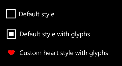
While you can leave the controls as they are right now, the purpose of this article is to give an entry point so you can customize them further. What about styling the RadioButton in a similar way, too? Or using the CheckBox to mark favourite items with a heart icon? Now you can use whatever glyphs you like to give your app a more personalized look. This is just the entry point.
Source code
You can download the source code as a Visual Studio 2013 C#/XAML Universal App project from the GitHub repository. Feel free to use in any way you like since it’s MIT licensed, and if you have any questions or improvements contact me via the contact page or the repository’s issues page.
